Gourmet Sandwich
Project Overview
The Product:
This project involved designing a menu and delivery app for Gourmet Sandwich, a hypothetical premium London-based sandwich restaurant. Given that the business would focus on creating a more premium product at a higher price point, the initial idea was to envisage the following as target users:
- Live in London
- 18-62 years old
- Professionals / office workers
- Tourists
Project Duration:
Start Date: 13th November 2022
Completion Date: 22nd January 2023
The Problem:
Many people don’t always have the time to buy or order a healthy meal due to having a busy lifestyle. Also, people with specific dietary requirements may not feel confident about the content of the food they are ordering.
The Goal:
This project aimed to help people with busy lifestyles to have a streamlined, stress-free food ordering experience. There was also a particular focus on clearly presenting dietary information so that people with specific dietary requirements, such as vegans and vegetarians, would be able to order with confidence.
My Role & Responsibilities:
Lead UX Designer from conceptualisation to final design.
My responsibilities included user research, storyboarding, wireframing, prototyping, usability testing and development of hi-fi mockups.
User Research
Research Summary
The user research conducted included but was not limited to rigorous competitive analysis, user interviews, empathy mapping, persona creation and journey mapping.
This was a lot more comprehensive than I was expecting but it really helped yield valuable and actionable insights going into the design phase.
Pain Points
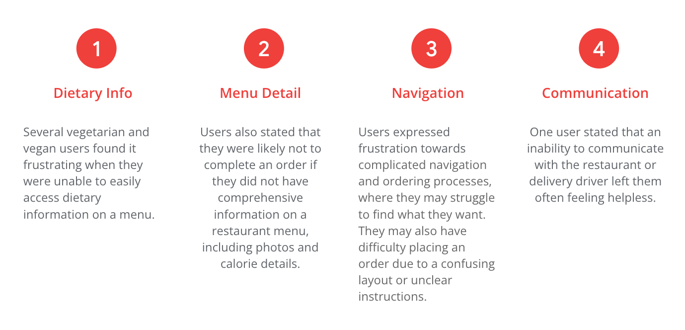
From user interviews, the following paint points were identified:
Personas
Based on the user research carried out thus far, I created two personas that represented users’ goals, needs, frustrations and preferences. This helped me to empathise with the target audience and design the app accordingly.
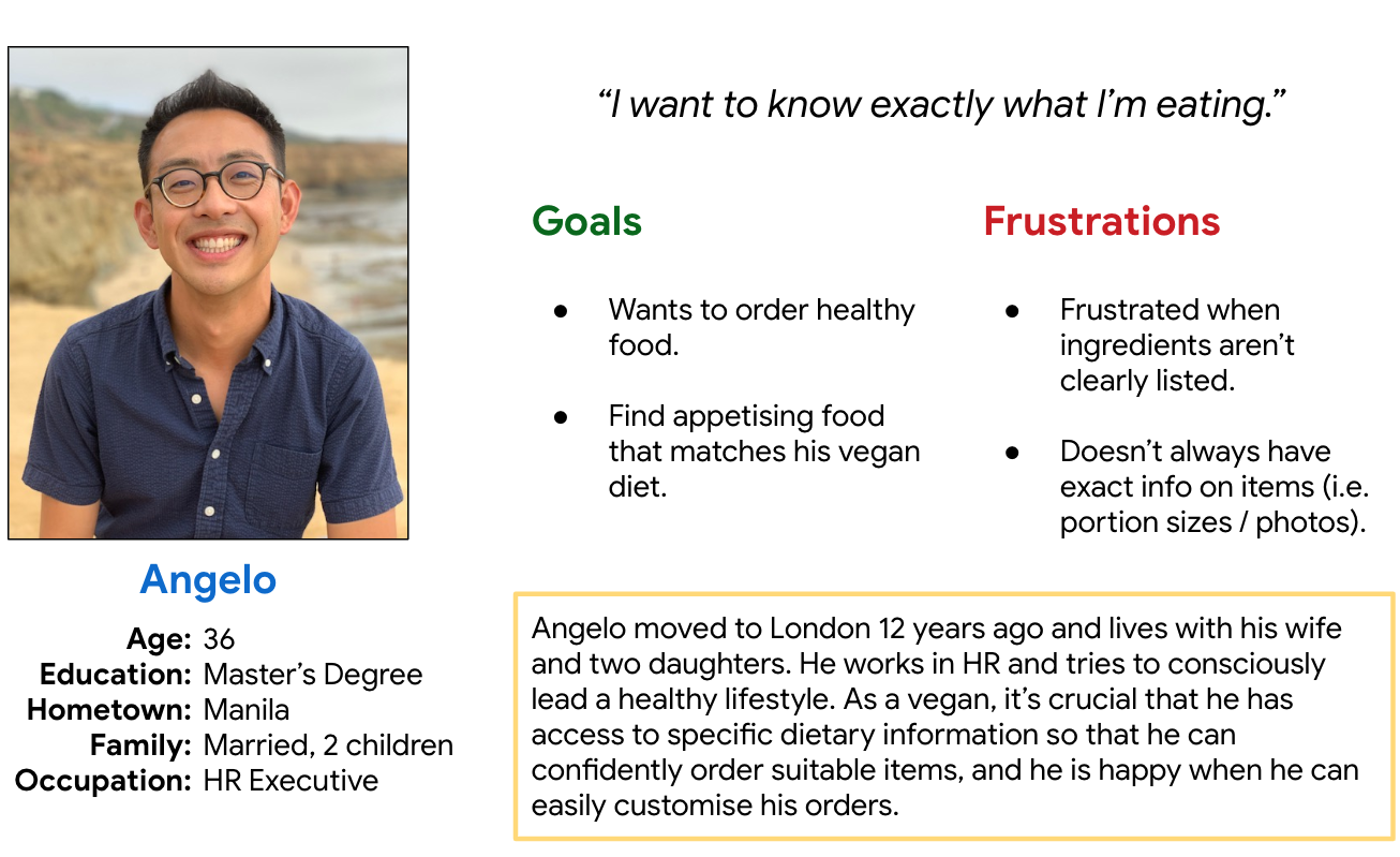
Problem statement:
Angelo is a vegan who needs access to information on the ingredients of each menu item because of his specific dietary requirements.
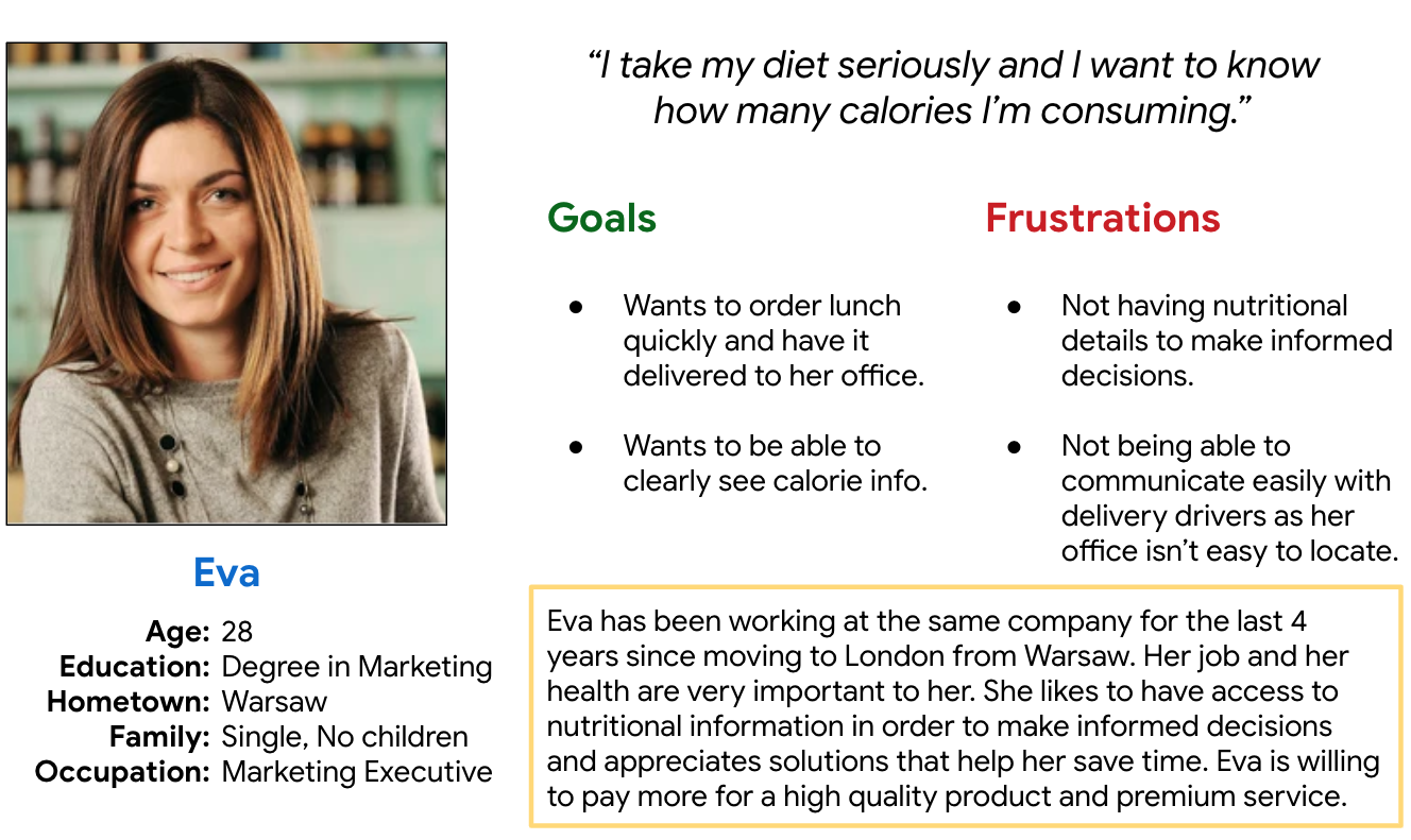
Problem statement:
Eva is a health-conscious eater who needs clear nutritional information because she likes to track how many calories she consumes.
User Journey Map
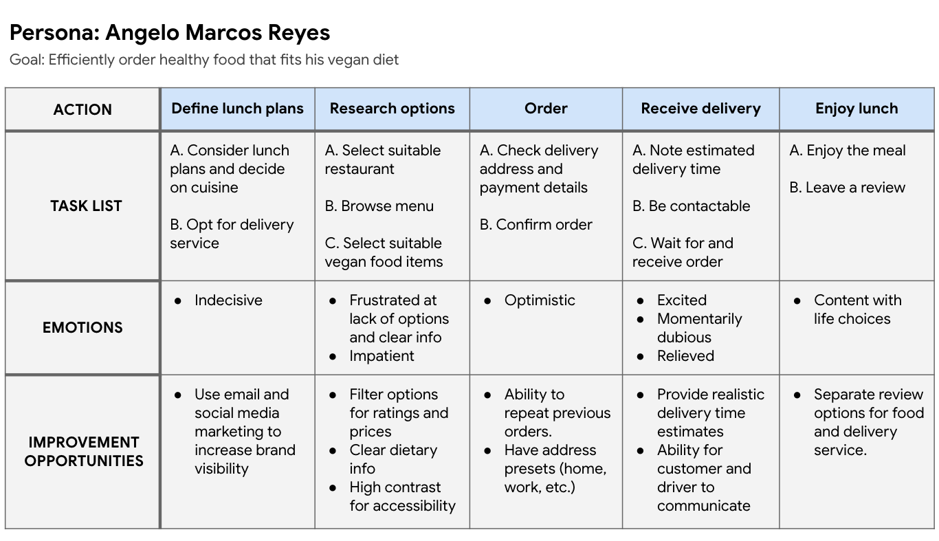
The journey map below outlines Angelo’s usage of the app and allowed me to identify opportunities for improvement.
Competitive Audit
To conclude the research phase of this project, I conducted a competitive analysis of four competitors. The audit covered both direct and indirect key competitors and allowed me to gain an impression of the user experience within their sites/apps, and crucially, to identify any gaps and opportunities.
Starting the Design
Ideation
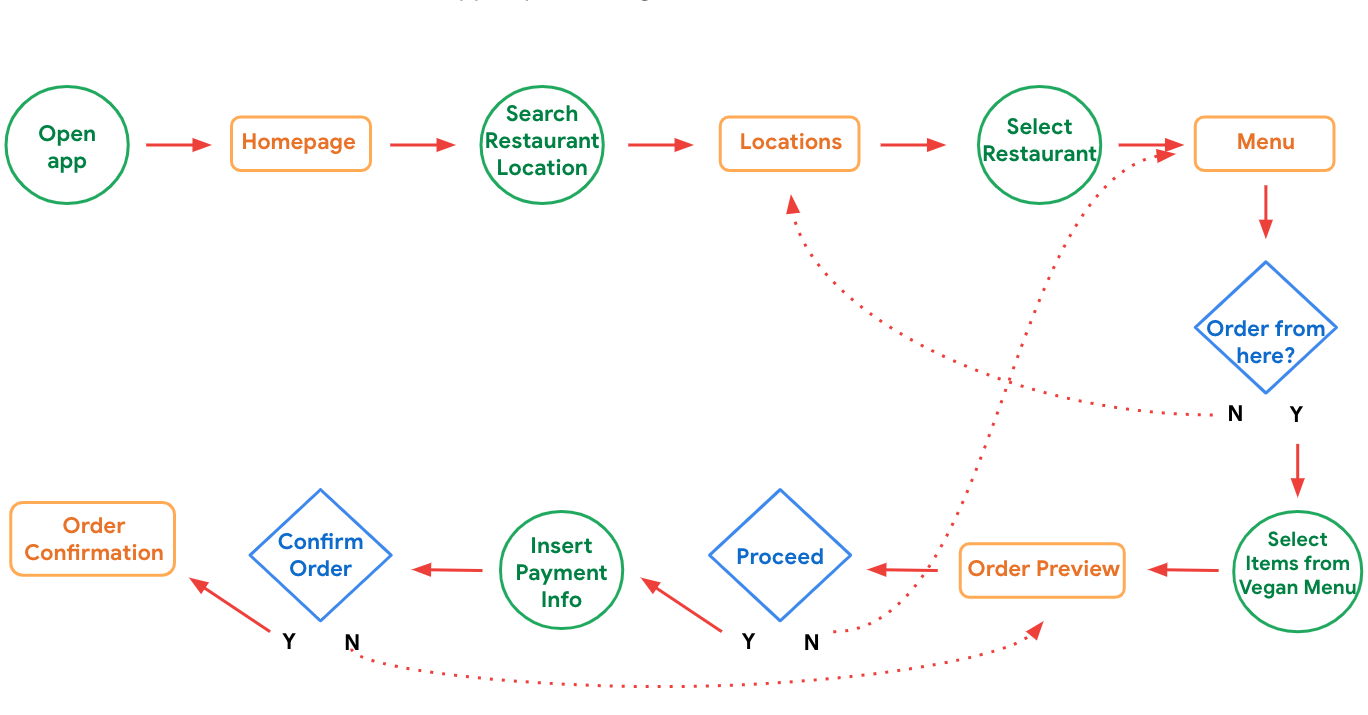
To get a better idea of the structure of the app, I created some goal statements from which I formed the user flow below:
Paper Wireframes
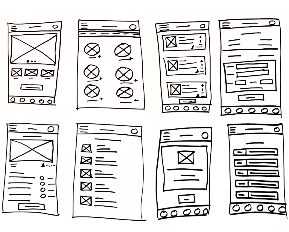
Then in order to get a better feel of how the app might look, I carried out some ideation and sketching exercises. Keeping in mind the insights gained throughout the research phase, I did some ‘How Might We’ and ‘Crazy Eights’ exercises, which informed my paper wireframe designs.
Digital Wireframes
After selecting the most appealing elements from my sketches, I created the digital wireframes in Figma.
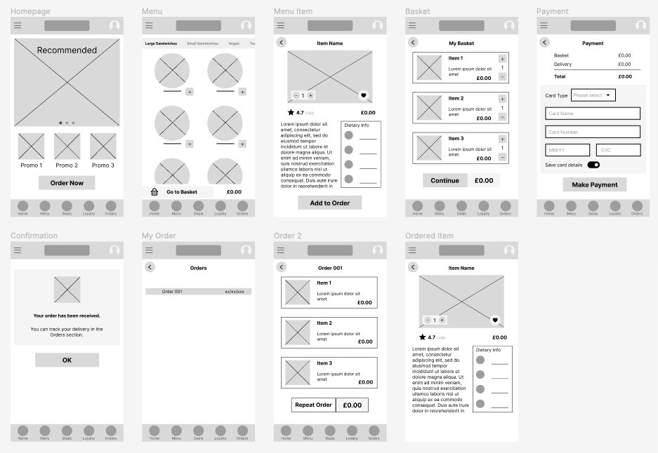
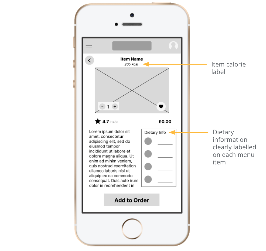
Given the research carried out among users with specific dietary requirements, I aimed to create a simple solution that would prevent users from feeling frustrated at a lack of clear dietary info.
Low-fidelity Prototype
I then created a low-fidelity prototype based on my paper wireframes, which enabled me to test the app’s basic functionality and usability. This prototype was then tested with users to identify any issues and make necessary improvements.
View prototype here.
Usability Study
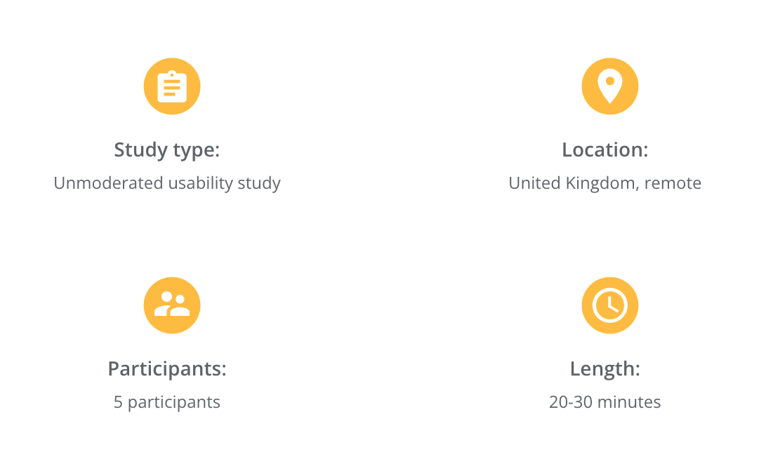
In order to assess how effective the prototype was, I conducted a usability study. For a more in-depth look, see details here.
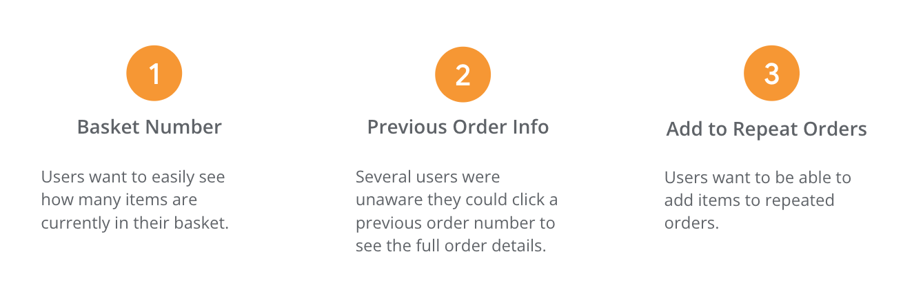
These were the principal actionable findings of the study:
Refining the Design
Mockups
The next stage of the process was to refine the design keeping user feedback in mind to create high-fidelity mockups.
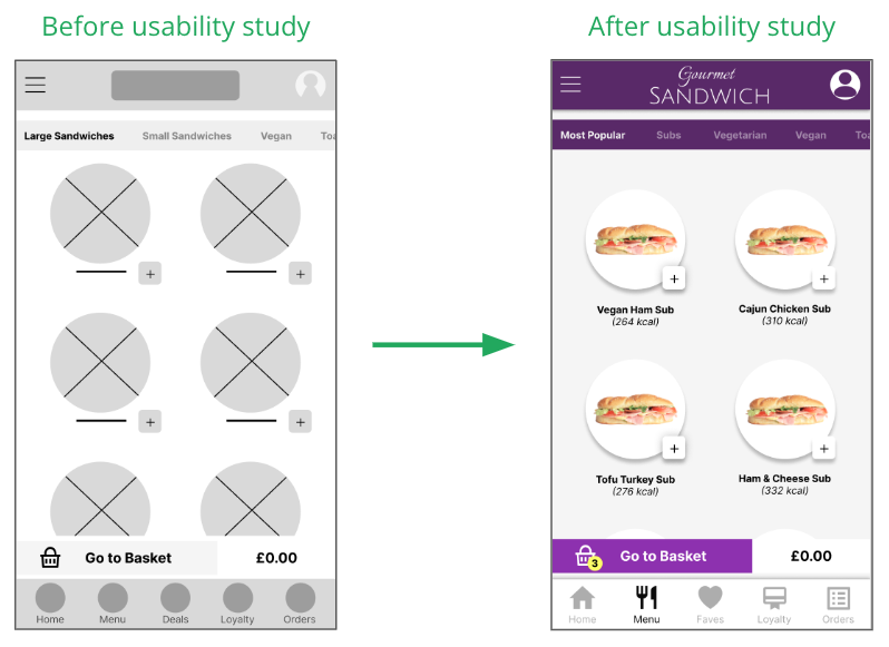
Firstly, for ease of viewing, I added the number of items in the basket as users stated this would be beneficial to their ordering experience.
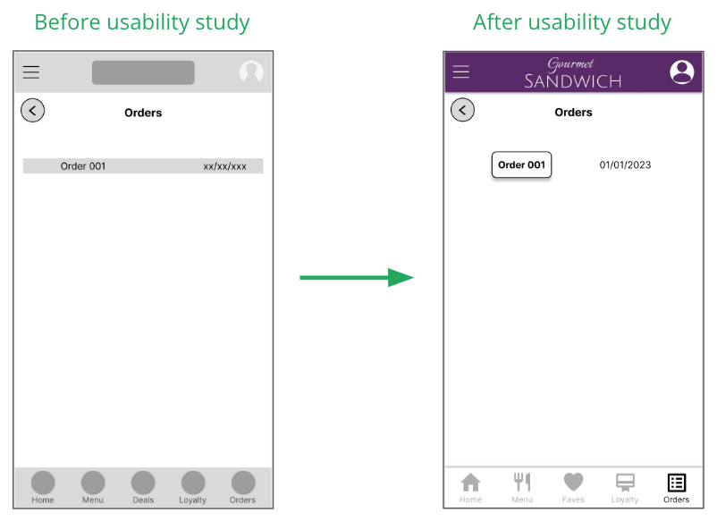
Then based on my second insight, the Orders screen was redesigned to make previous orders more visibly clickable.
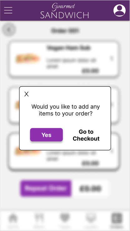
Finally, I created a new screen that adressed my third insight. Initially, users could only repeat a previous order with the exact same items. The updated design features a screen that gives users the option of adding items to a previous order.
High-fidelity Prototype
Once complete, I prototyped the screens to replicate the flow of the final product and then retested it to check its functionality.
You can view this prototype here.
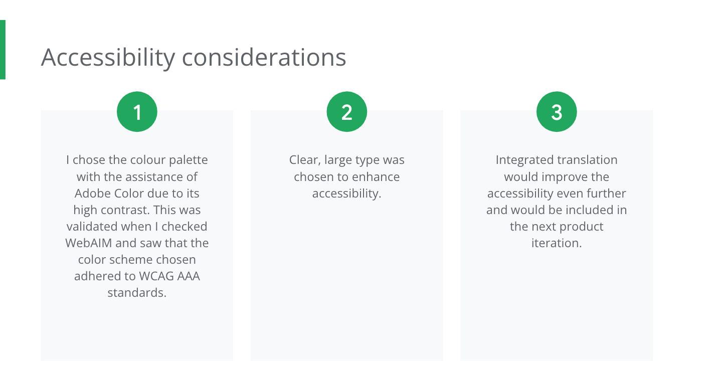
Accessibility Considerations
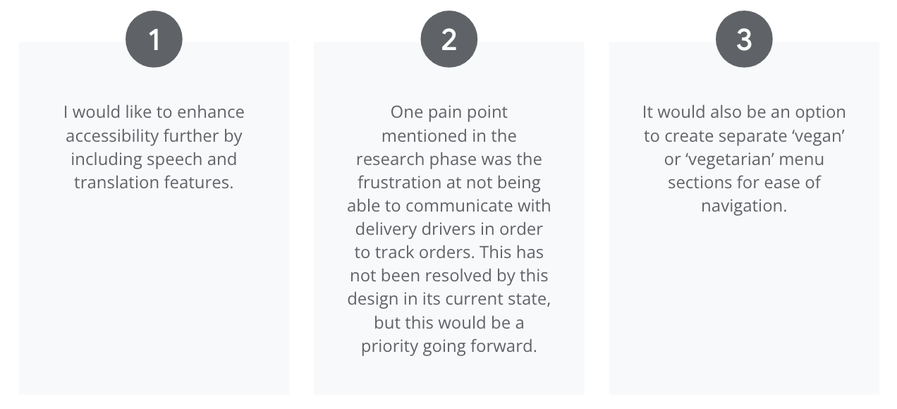
Going Forward
Impact
After sharing my high-fidelity prototype with users, they had plenty of positive feedback regarding the simplicity of the design and how intuitive it is to use.
One user said:
This app would massively help me when ordering food as a vegan. It’s really frustrating not knowing what I can and can’t order and this app solves that issue.
What I Learned
As this was my first UX design project, I learnt several valuable lessons about the design process. Here are the most significant:
-
I learned the importance of conducting thorough user research to gain insights into user needs and behaviours, which helped me to design solutions that met their needs.
-
I also learned the value of an iterative design process, which involved creating multiple prototypes and testing them with users to refine and improve my designs.
-
Finally, I learned about enhancing accessibility in my designs and the value that brings in catering for people’s diverse needs and creating a product that a wide range of people can use and identify with.
Next Steps
