PetHero
Project Overview
The Product:
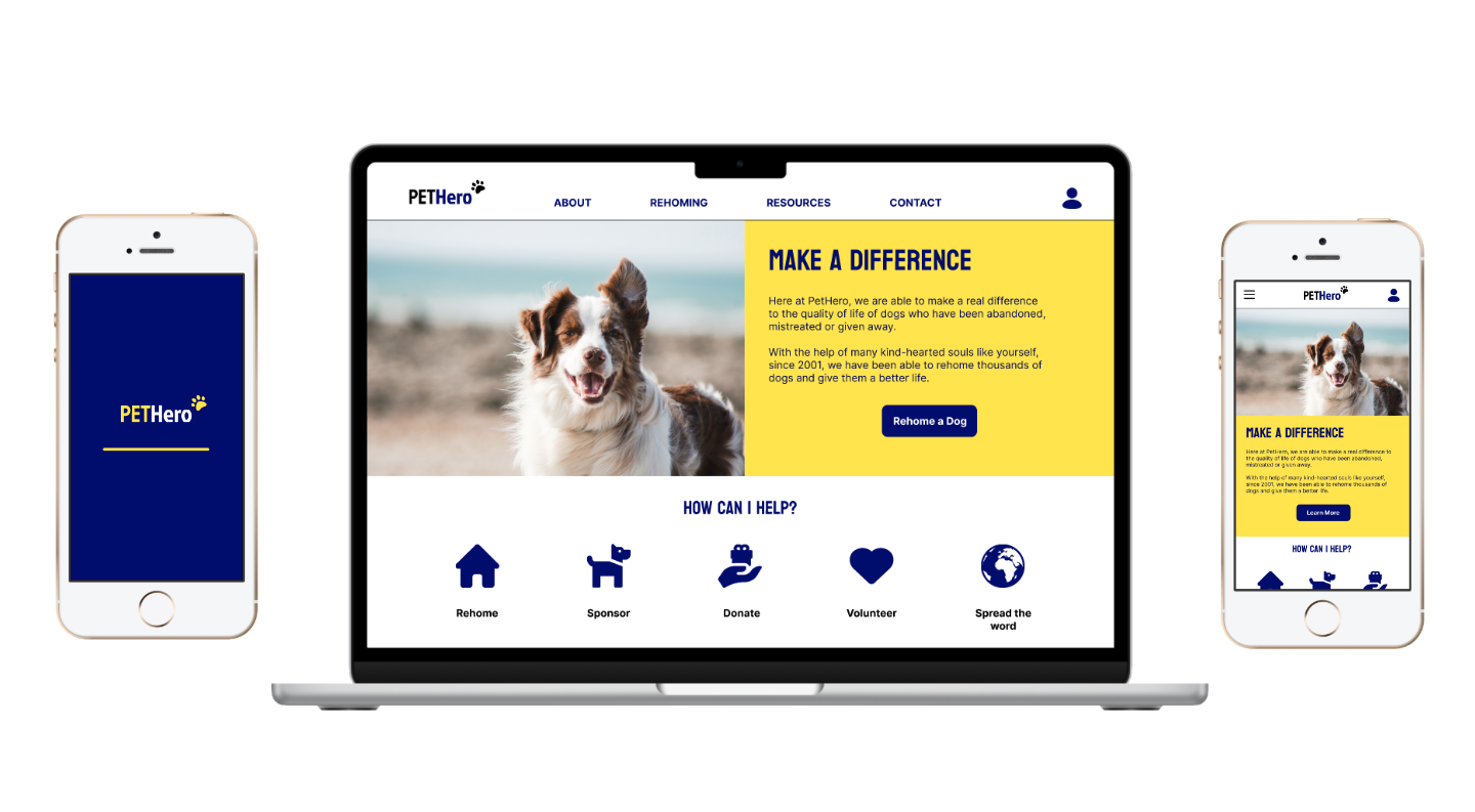
In this project, I was tasked with designing a responsive pet adoption site and its fundamental user flow. I was inspired to create PetHero, which focuses on a simplified dog rehoming process.
Project Duration:
Start Date: 22nd February 2023
Completion Date: 22nd March 2023
The Problem:
Pet adoption processes are generally arduous and even outdated with paper application forms. Many of the organisations who offer pet adoption services have dense, unclear copy on their websites which may put potential adopters off.
The Goal:
Rehoming a dog should be an exciting, painless journey for adopters and so the aim within this project was to create an enjoyable, clean and smooth pet adoption process.
My Role & Responsibilities:
Lead UX Designer from conceptualisation to final design.
My responsibilities included comprehensive user research, wireframing, prototyping, usability testing and development of hi-fi mockups.
User Research
Research Summary
During the research phase of this project, I aimed to gain a better understanding of the user experience of a pet adoption platform and identify areas for improvement.
The user research conducted included (but was not limited to) user interviews, creating personas, journey mapping, empathy map construction and rigorous competitive analysis.
Through in-depth interviews and usability testing with several participants, I was able to uncover valuable and actionable insights going into the design phase and gain a much clearer idea of what prospective pet adopters consider to be important information when making decisions throughout the rehoming process.
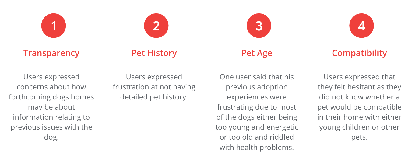
Pain Points
From user interviews, the following pain points were identified:
Personas
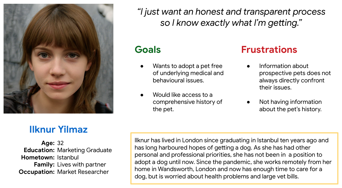
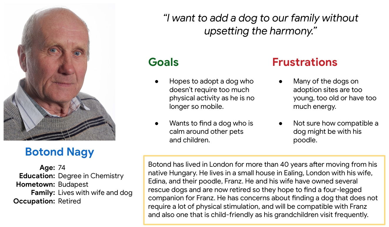
Based on the user research carried out thus far, I synthesised my insights to create two personas that represented users’ goals, needs, frustrations and preferences. This helped me to empathise with the target audience and design with users in mind.
Problem statement:
Ilknur is a young professional working in London. She would like to adopt a dog but is worried about unavailable pet histories and potential large medical bills due to underlying health issues.
Problem statement:
Botond is a man in his 70s living in Budapest, Hungary. He and his wife would like to adopt but have concerns about compatibility with their poodle and their grandchildren.
User Journey Map
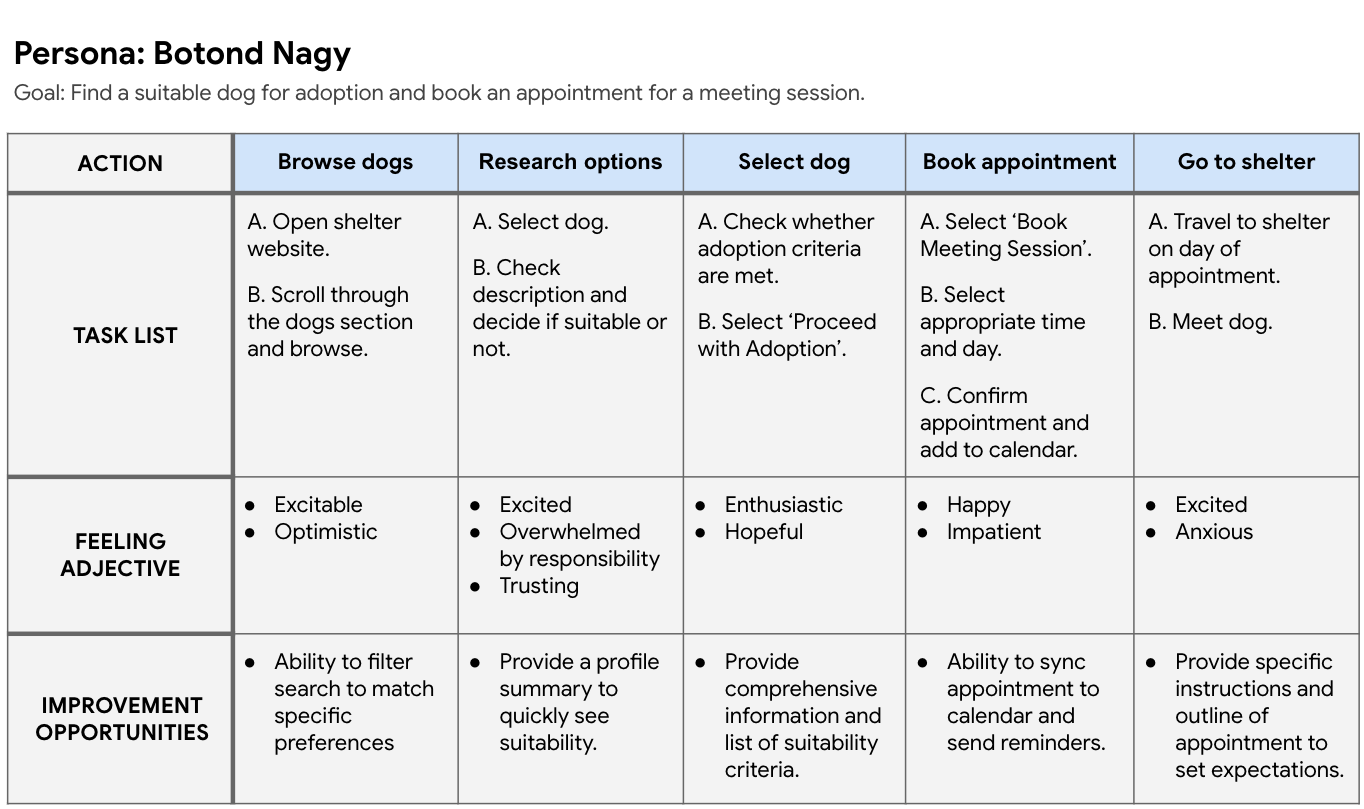
I then created the journey map below in order to mark out Botond’s usage of the product. This allowed me to gain a holistic view of the overall user experience of similar products. This in turn enabled me to identify key touchpoints as well as opportunities for improvement.
Competitive Audit
To conclude the research phase of this project, I conducted a competitive analysis of four competitors. The audit covered both direct and indirect key competitors and allowed me to gain an impression of the user experience within their sites, and crucially, to identify any gaps and opportunities.
Starting the Design
Sitemap
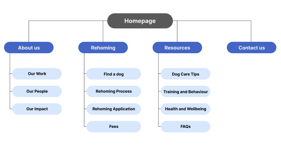
I began the design phase of this project by building a rudimentary sitemap in order to better understand the information architecture of the site. The aim was to create a structure that would provide sufficient information and resources whilst maintaining a simple architecture so as not to frustrate users since the adoption process should be an enjoyable one.
Paper Wireframes
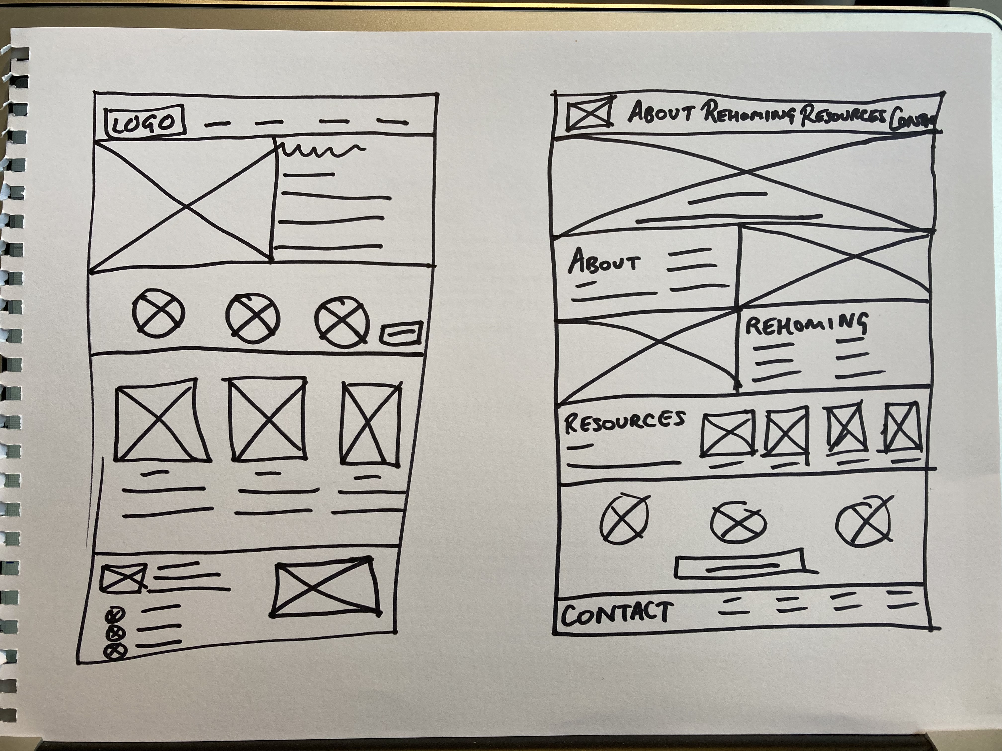
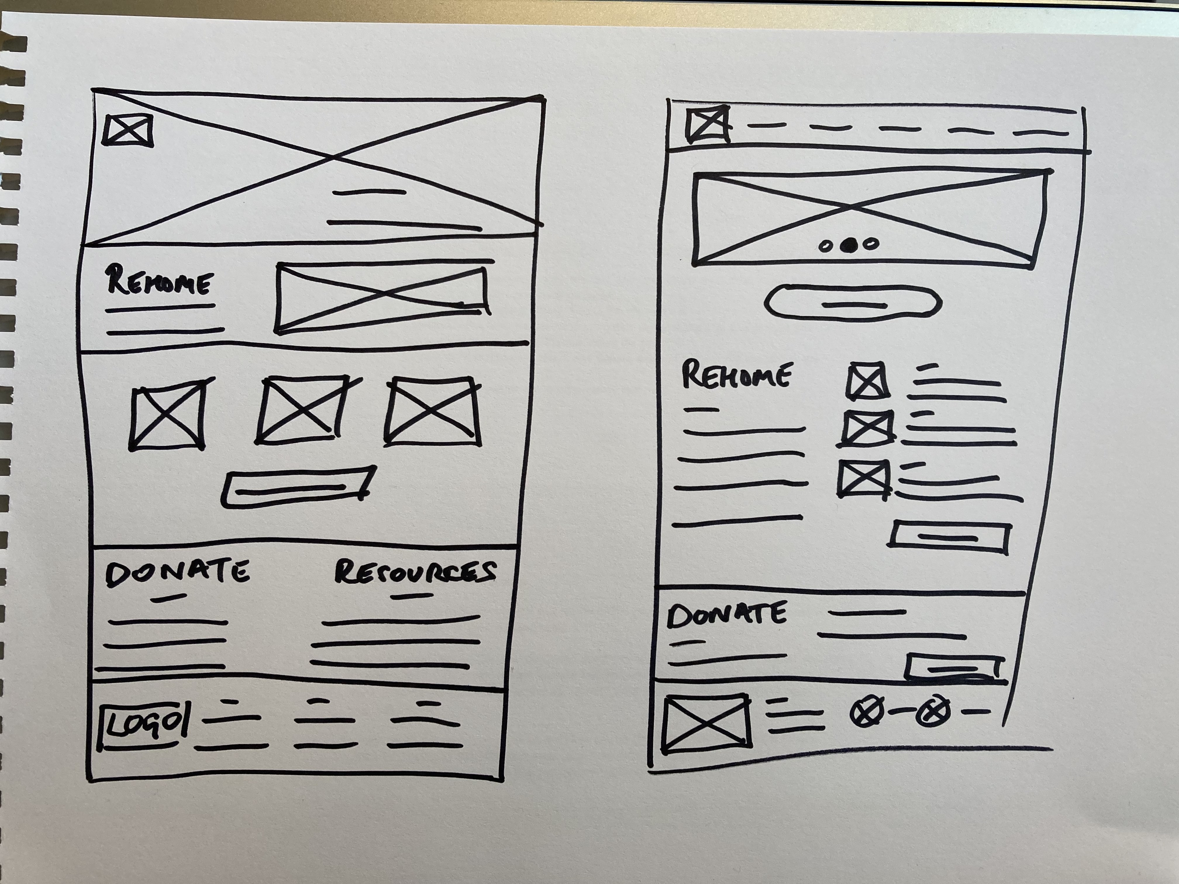
Then in order to get a better feel of how each page on the desktop site might look, I carried out some ideation and sketching exercises. Keeping in mind the insights gained throughout the research phase, I did some ‘How Might We’ and ‘Crazy Eights’ exercises, which informed my paper wireframe designs.
Digital Wireframes
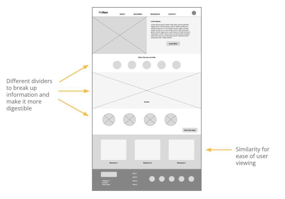
After selecting the most appealing elements from my sketches, I created the digital wireframes in Figma.
For the desktop site, I opted for a tiered layer cake layout and tried to consider Gestalt principles of common region, similarity and proximity when forming my wireframes.
Screen Size Variation
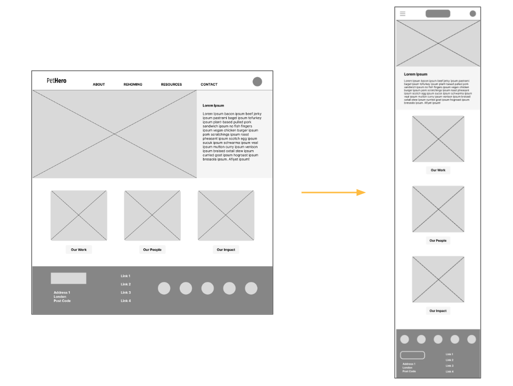
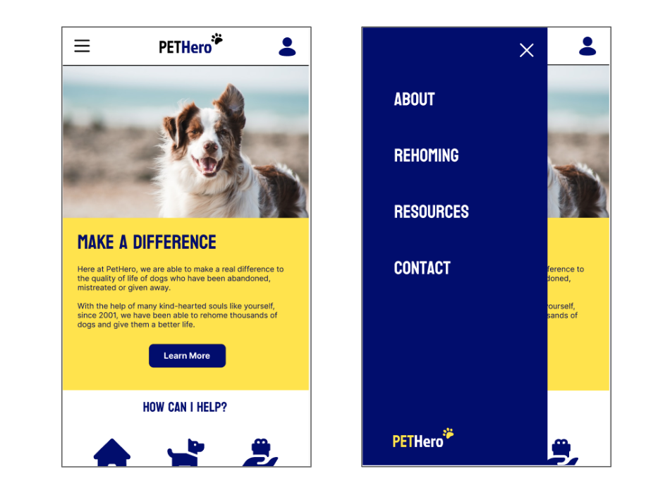
I also needed to consider how my design would respond across devices with different screen sizes. I started to create a framework for how the different elements in my design would be modified for mobile screens.
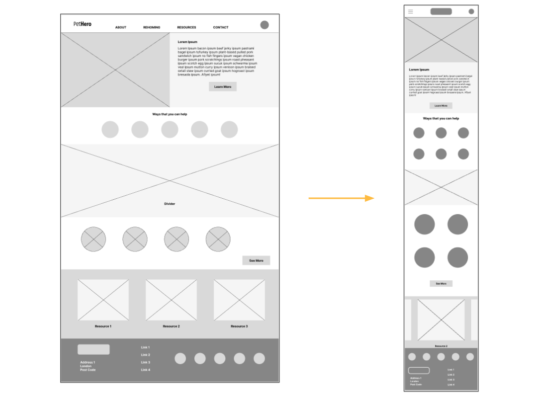
This was a fairly simple process for the screen below as I merely had to rearrange the cards and text vertically.
Low-fidelity Prototype
I then created a low-fidelity prototype based on my paper wireframes, which enabled me to test the app’s basic functionality and usability. This prototype was then tested with users to identify any issues and make necessary improvements.
View prototype here.
Usability Study
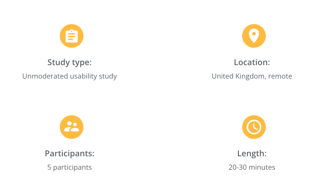
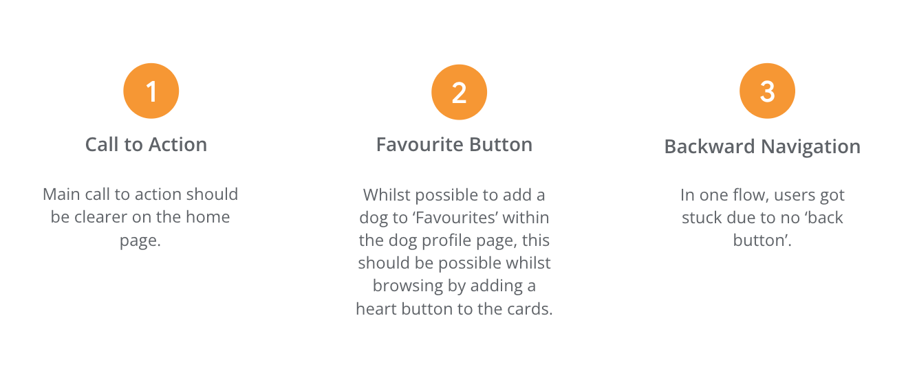
In order to assess how effective the prototype was, I conducted a usability study and here were my findings:
Refining the Design
Mockups
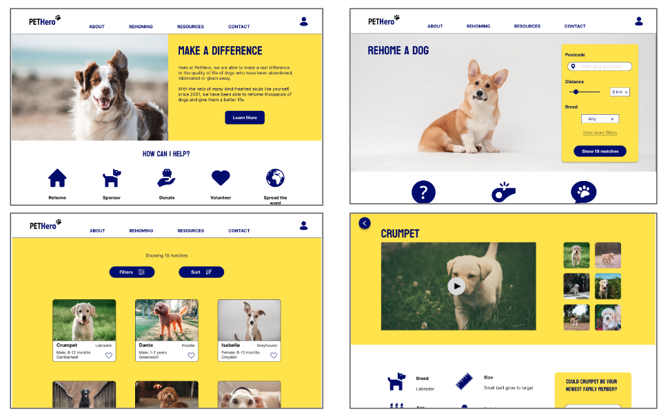
The next stage of the process was to refine the design keeping user feedback in mind to create high-fidelity mockups.
The addition of a heart button on each card meant that users no longer needed to enter a dog profile page in order to add it as a favourite.

The addition of icons on the dog profile page added character to the site which users found to be more enjoyable. The main call to action button on the right was also highlighted in a darker colour.
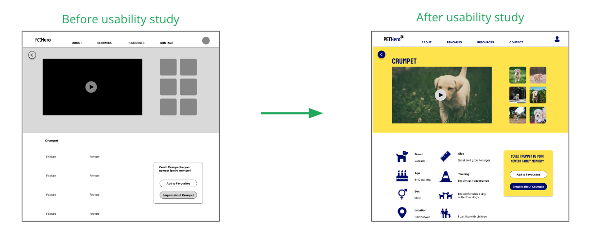
The final concern highlighted was a simple navigational failure meaning users got stuck in a flow without the possibility to go back. This was resolved by simply ensuring that back buttons were included on all the relevant screens.
Desktop Version
Mobile Version
High-fidelity Prototype
Once complete, I prototyped the screens to replicate the flow of the final product and then retested it to check its functionality.
You can view this prototype here.
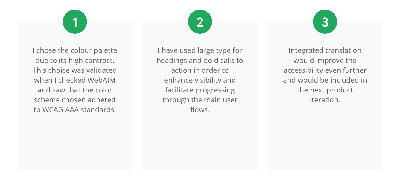
Accessibility Considerations
Going Forward
Impact
One user mentioned that they would love to use the PetHero site. They had looked into adopting a dog before but were put off by the overcomplicated and outdated processes that they were required to go through. They said that this site, however, felt a lot more intuitive and simplified and therefore the dog adoption process seemed significantly less daunting.
What I Learned
I really got to grips with Figma during this project, discovering how to create flyout menus and cool animations that increase user engagement. This felt especially necessary for this product as looking at dogs to adopt should be a fun, enjoyable experience and I have tried to reflect that in my design choices.
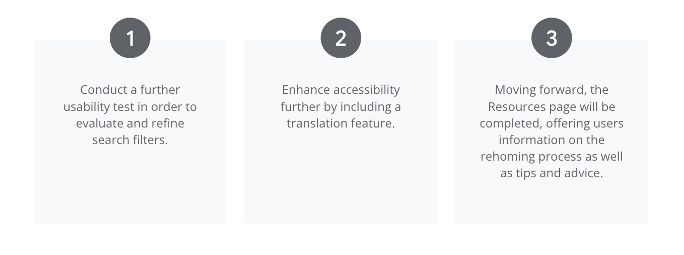
Next Steps
