Flourish
Project Overview
The Product:
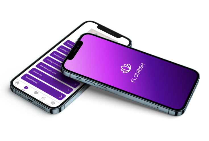
This project was an entry to Avanade’s global hackathon in recognition of International Women’s Day, in which participants were given just 48 hours to create a digital solution demonstrating how technology might be used to assist refugees seeking access to sexual and reproductive health resources. My teammate and I decided to design an information and community hub for refugee victims of female genital mutilation (FGM) in the UK, and our entry went on to win the hackathon.
Project Duration:
Start Date: 4th March 2023
Completion Date: 6th March 2023
The Problem:
Female genital mutilation is a practice that offers no health benefits but causes life-long damage for those affected physically, psychologically and socially.
An estimated 200 million women and girls worldwide have been subjected to some form of female genital mutilation - a procedure that offers no real benefits. In the UK alone, an estimated 137,000 girls and women are survivors of FGM living with the severe physical, psychological and social consequences of the practice, with a further 60,000 girls under the age of 15 at risk of mutilation.
With a new environment, language, and culture to navigate, refugees are particularly vulnerable and may struggle to access the resources and services necessary to maintain their physical and mental health.
The Goal:
The aim of this project was to provide informative resources to refugee victims or those under threat of FGM as well as a community hub so that questions could be asked and answered.
The app’s goal is to inform and empower.
Research & User Analysis
Research Summary
To begin the project, we conducted thorough research on FGM and its impact on survivors. This included reviewing existing literature to gain an understanding of survivors’ needs, challenges, and expectations from an app.
Unfortunately, due to the specific and sensitive nature of the topic we were dealing with, the level of stigma around it, and a very limited timeframe in which to work, conducting interviews with survivors wasn’t possible. This meant working almost exclusively with secondary research.
Key Findings
1. Lack of education: Survivors of FGM may have limited knowledge about their own health, needs and rights, which can affect their ability to seek appropriate support and make informed decisions about their health.
2. Support: A 2017 study published in Reproductive Health highlighted the importance of social support networks in facilitating the recovery and reintegration of FGM survivors.
3. Access: According to a 2019 report by the UN Refugee’s Agency in refugee camps, 85% of households had at least one mobile phone and 77% of refugees surveyed in a sample of 11 countries owned a mobile phone while 22% of refugees have access to a computer or tablet.
4. Privacy: The prevalence of FGM is upheld due to deeply embedded social and cultural norms, often leading to social exclusion and a lack of open discussion around the practice. As a result, women and girls affected greatly value privacy and security due to the sensitive and personal nature of their experiences. They require a safe space where they can connect with others without fear of judgment or breach of privacy.
Persona
A persona was then created based on the above insights. This enabled us to focus on victim-centred designs.

Problem statement:
Nadia is a refugee and survivor of FGM who needs information and support because she feels isoltaed and is concerned about her wellbeing.
Design Solutions
With the issues identified above as well as our persona in mind, my teammate and I together took part in some ideation activities such as Crazy Eights and How Might We’s. We came up with the following solutions:
1. Educational Resources: A library of resources including information on physical and mental health, legal resources, and support groups. This influenced our content strategy and inforation architecture as content could be categorised into four main elements of our app: My Mind, My Body, My Rights and My Community.
2. Community Support: A moderated forum where victims are able to ask and answer questions amd share their experiences. We hope that this can prevent alienation and create a sense of community by providing a safe space for open discussion as well as enabling users to gain key information.
3. Mobile First Approach: Seeing as refugees are almost four times more likely to own a mobile phone than a laptop or computer, we decided to focus on a mobile first design approach.
4. Anonymity: In order to protect the identity of victims and encourage open discusion without fear of judgment, we decided it completely necessary to keep all posts in the forum anonymous.
Starting the Design
Wireframes
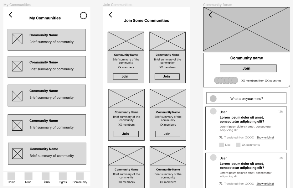
After sketching out variations of screens, our preferred elements were synthesised and built into the following wireframes:


One accessibility consideration made early on in the design phase was to include several different languages in their own scripts on the opening screen for users to choose from.

Low-fidelity Prototype
We rapidly built a prototype with the wireframes in Figma, which enabled me to test the app’s basic functionality and usability. This prototype was then tested with users to identify any issues and make necessary improvements.
View prototype here.
Internal Testing
To ensure that the app was user-friendly and met the needs of its target users, the team conducted internal testing. This involved sharing the prototype with colleagues and soliciting feedback. We received valuable feedback on the app’s design and functionality, which we then used to make the improvements outlined below.

Refining the Design
Bookmarks: The addition of a bookmark button in the top right corner of the screen allows users to be able to save specific articles or resources for later reference. Bookmarked pages can be found in the ‘My Resources’ section on the homepage.

Onboarding Experience: We created an app onboarding flow in order to introduce first-time users to Flourish and its purpose.

Forum Enhancements: Our final iteration means that users now have the ability to scroll between all posts (‘Posts’), a community description page (‘About’), and ‘Pinned’ which shows the most popular and relevant posts first.

Visual Design
Colour Palette: Purple is associated with empathy, reliability and empowerment - values we wanted to show commitment towards. Purple is also frequently used in campaigns that raise awareness about violence against women, such as International Women’s Day, and as such, we decided to use it as our lead brand colour.

High Contrast: We opted for a high contrast colour scheme to maximise accessibility for individuals with visual impairments. This choice was validated by WebAIM as the scheme adhered to WCAG AAA standards.

Type: We chose Plus Jakarta Sans for its versatility and clean, modern design. Its slightly rounded edges and soft curves give it a friendly and approachable feel, while its straight lines and uniform spacing create a sense of order and precision. This perfectly mirrored the aim of our product in creating a safe and welcoming space whilst being reliable and exact.

Icons: We chose large, friendly-looking icons - again with soft rounded edges - to make the app more approachable and easy to use. They were designed to be simple and intuitive, aided by clear labels that communicate their purpose. We also ensured that they were large enough to be easily clickable, even for those using the app on a smaller screen.

App Logo: We decided on using a simple representation of a lotus flower as the main symbol of our product. This seemed an apt choice for our product given that the flower is admired for its ability to grow and thrive in adverse conditions. It represents resilience, transformation and the idea of rising above challenges to ‘flourish’.
The lotus flower is also known for growing in communal clusters, which can represent a sense of community and support - values that we hoped to foster with our product.
We were also mindful of ensuring that the lotus icon would be discreet. We were wary of the app potentially drawing unwanted attention from family members or other individuals who may be monitoring the user’s device, and to protect their anonymity and safety. In choosing the lotus symbol, we aimed to make sure that the app remained discreet whilst still conveying a positive message of hope and empowerment for FGM victims.

Mockups


High-fidelity Prototype
Once we were satisfied with the designs, we prototyped the screens to replicate the flow of the final product and then retested it to check its functionality.
You can view this prototype here.
Responsive Design
Given the limited time we had to complete this project as well as the fact that our research suggested that refugees are significantly more likely to own mobile phones than other devices, we made the decision to focus on designing for mobile phones. However, after the conclusion of the hackathon we took the time to explore how users might have different needs and preferences, and how we might diversify our designs across devices accordingly.
Here are some examples of the results:


Conclusion
At the end of the hackathon, the team presented our final design and prototype. We received overwhelmingly positive feedback from judges and participants alike, who praised the app for its focus on user privacy, education and support.
We went on to be selected by Avanade and the International Rescue Committee as hackathon winners.
What I Learned
The process of designing an educational and community app for survivors of FGM in just 48 hours was definitely not as easy task. FGM being such a complex and delicate issue presented several challenges, which required a greater level of empathy and sensitivity than perhaps any other project we had been involved in before. Not being able to get firsthand insights from victims made this even more challenging.
The nature of the hackathon with its time constraints was also testing and we needed to be flexible while staying true to our research and objectives. It was essential that we delegated, prioritised and communicated effectively throughout.
Finally, despite all the challenges faced over the weekend, this was an incredibly rewarding experience. On a personal level it was a timely reminder of the power of technology and the responibility we have to use it to make a significant positive impact. Designing an app that would be accessible and intuitive to use for refugees with diverse backgrounds, experiences and abilities really forced us to deeply consider the ways in which we could create an experience that would be as inclusive as possible.
In the end, we were thrilled to hear that our design had met our aim in having the potential to affect real and meaningful change.
